What actually happens when you use a CSS transform
'transform' is a powerful CSS attribute and we're all told we should use it "for performance". But why? I'm going to find out.
For the uninitiated, transform allows us to do any of the following to an element:
So far so good. But if you've used it before you might have discovered that sometimes it does other stuff too, whether you ask it to or not. Try ticking the checkbox in this example:
Wait, what? Why did the square suddenly leap in front of the circle? I didn't set a z-index! It's not a bug. In fact, the spec specifically says that this will happen:
This module defines a set of CSS properties that affect the visual rendering of elements to which those properties are applied; [...] Some values of these properties result in the creation of a containing block, and/or the creation of a stacking context.
MDN does a far better job of explaining what a stacking context does than I can but it doesn't address why the browser deliberately creates a new stacking context when applying a transform. I just want to rotate something, why are you making it so complicated?!
For years now I've used CSS transforms because I've been told they're "good for performance" and "use hardware acceleration" but I've never really questioned why. Or how, for that matter. Curiosity has finally got the better of me and I've decided to investigate.
How does a browser render things, anyway?
For this exploration I'm going to use WKWebView, the browser engine Apple provides for use in iOS and macOS apps. You can mostly think of it as "Safari without the UI parts". I'm mostly using it because I'm familiar with it (I spend a lot of time at my work in this weird intersection between web and native) but also because it's a great environment to go spelunking: I've got a load of debug tools available and I can get up and running very quickly (i.e. I don't have to spend hours building it).
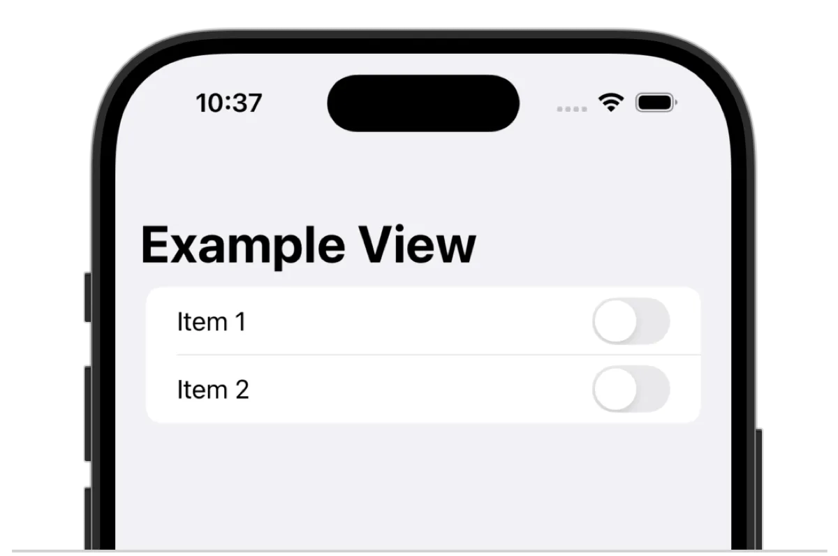
Native views on iOS (and most other OSes) follow a straightforward hierarchy: you start with a view, that view has subviews, the subviews have subviews and so on. Take this example:

Then look at the hierarchy of views:
└> UINavigationBar
└─> _UINavigationBarLargeTitleView
└──> UILabel
└> UITableView
└─> UITableViewCell
└──> UILabel
└──> UISwitch
└─> UITableViewCell
└──> UILabel
└──> UISwitch
That matches what we see: a table, two cells, each with a label and a switch. Now let's load up some web content in the webview:

I've got some text, some boxes and a button. But if I fire up my debug tools I see something completely different:
└> WKScrollView
└─> WKContentView
└──> UIView: FixedClipping
└───> UIView: RootContent
└────> WKCompositingView: drawing area root 6-1
└─────> WKCompositingView: content root
└──────> WKCompositingView: RenderView 0x141002cd0
└───────> WKCompositingView: TileGrid container
└───────> WKCompositingView: Page TiledBacking containment
You'd be forgiven for giving up and walking away as soon as you see this. But "TileGrid" is the giveaway here. The browser doesn't render each component as its own native view, instead it's smooshing everything down and using tiled rendering to present it to the user. If I take a look at the sublayers inside TileGrid container I see two:
- tile at 0,0 (x: 0.0, y: 0.0, width: 1180.0, height: 512.0)
- tile at 0,512 (x: 0.0, y: 512.0, width: 1180.0, height: 349.0)
Showing that I've got two tiles, vertically stacked, running the full width of the screen. If I turn on layer highlighting (a debug tool you can enable via Safari dev tools or in code with a library I threw together) you can see exactly that:

I already feel like I know a little more about how stuff is rendered! Now let's take a look at what happens when I animate something.
Animation without transforms, then with transforms
Let's move the bishop without using a CSS transform, just animating the top and left CSS attributes. Keep an eye on the redraw counts in the top left of each tile:
Oof. Now I feel like I know a little more about why animation on the web is so much less performant than it is on native: we're redrawing half of the screen 154 times! But as I've always known (without knowing why), CSS transforms perform much better. So let's try it.
First off, as I know to be best practice, I'm going to set a new CSS property: will-change: transform. I feel like you can probably read between the lines to work out what it means. Let's take another look at the page.

Huh, a new border! With its own redraw count. Let's take another look at our native view stack:
└> UIView: RootContent
└─> WKCompositingView: drawing area root 6-1
└──> WKCompositingView: content root
└───> WKCompositingView: RenderView 0x141002cd0
└────> WKCompositingView: TileGrid container
└────> WKCompositingView: Page TiledBacking containment
└─────> WKCompositingView: RenderFlexibleBox 0x13b016f90 DIV 0x13b005db0
                           class='piece white animation-target'
A new native view has appeared! A RenderFlexibleBox. And the way its named is pretty unambiguous: it's the <div> I just applied the will-change CSS property to. So what happens when I animate by changing the CSS transform using translate3d(x,y,z)?
The bottom tile still redraws once (which I believe is because of me clicking on the "make move" button) but other than that we see no redraws at all. To find out how, let's dig into our native view a little more.
Web and native: not as far apart as you might think
The WKCompositingView is connected (via its .layer property) to a CALayer. The "CA" in that name stands for CoreAnimation, the Apple framework for, well, animation, but also just for displaying stuff visually. A quick read of the documentation states:
It accelerates the rendering by handing over most of the work to dedicated graphics hardware
accelerates... hardware...! We've finally closed the loop on what we've been told about CSS transforms (they perform better because they're hardware accelerated) with what we're observing:
- adding a CSS transform creates a new stacking context
- so that the isolated stacking context can be rendered separately in its own CALayer
- which can then be manipulated via hardware accelerated transforms rather than having to redraw the entire screen
In fact, if I take a look at our CALayer while the animation is running I can see that a CAKeyFrameAnimation is applied to it with the exact properties I specified in CSS: the transform coordinates, key times of the CSS animation and the duration I specified in the animation-duration CSS property.
So. The reason CSS transforms let you achieve native-like animations is because they literally are native animations, applied to a native layer, just like they are elsewhere on the OS.
...so I should just hardware accelerate everything, right?
Given what we've just learned it sounds like we ought to throw a will-change on everything, right? Get that hardware-accelerated rendering bonus everywhere! Well, no. There's a big caveat here: memory usage. But that's a topic worthy of its own post, which is exactly what I'm going to do next. If you're interested to find out when I do, please consider signing up for the e-mail newsletter:
I'm the world's least consistent blogger so I can assure you your inbox isn't going to be flooded. But hopefully we'll learn a few things together.